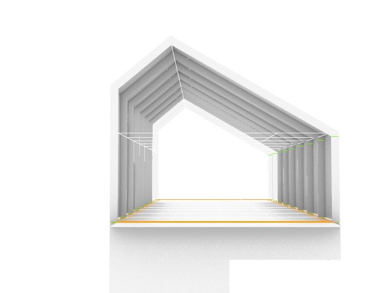
House Study
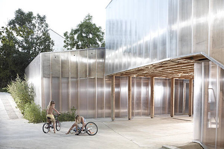
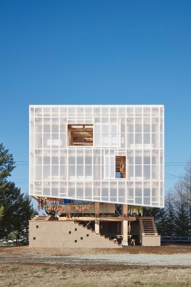
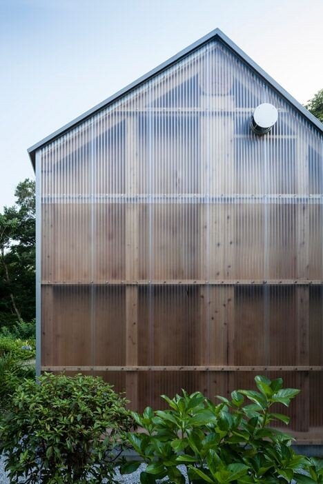
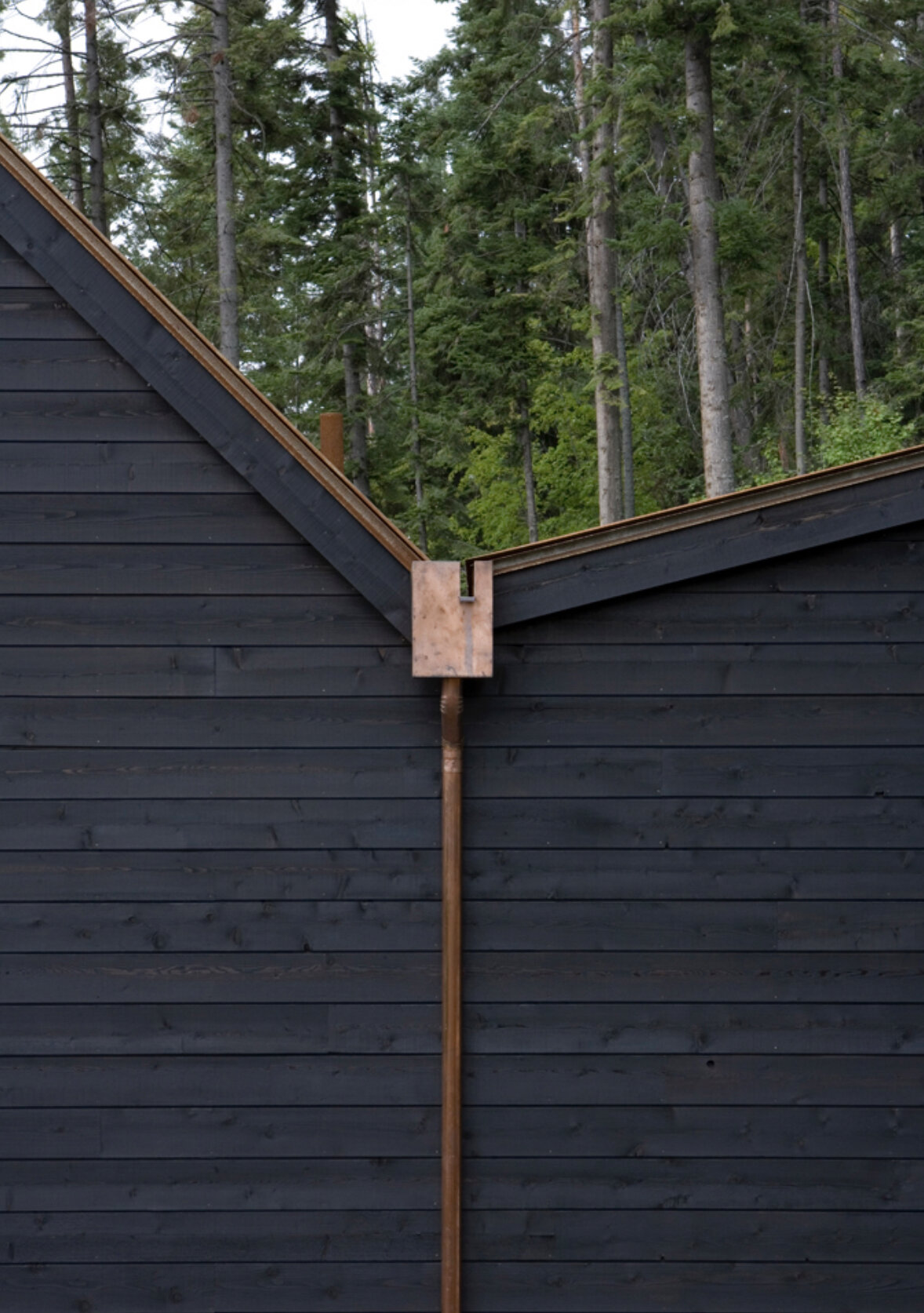
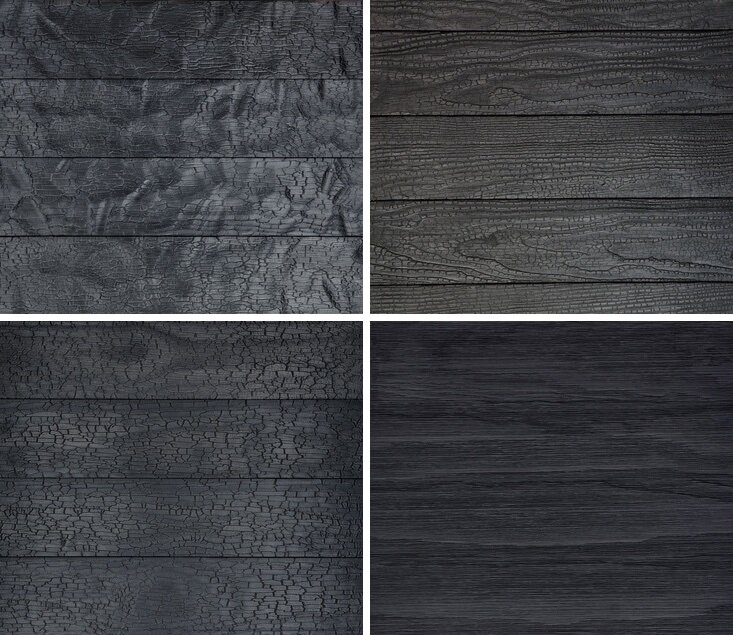
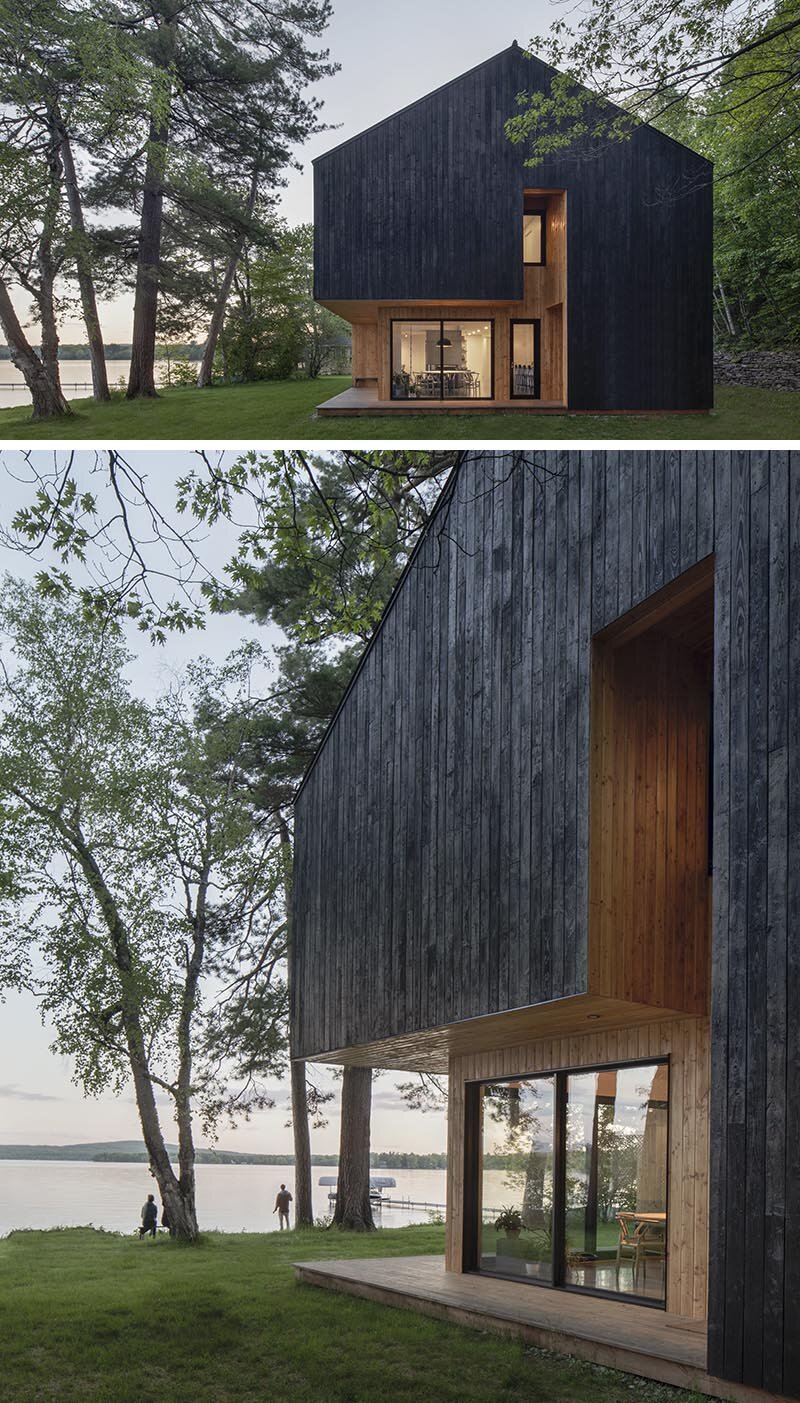
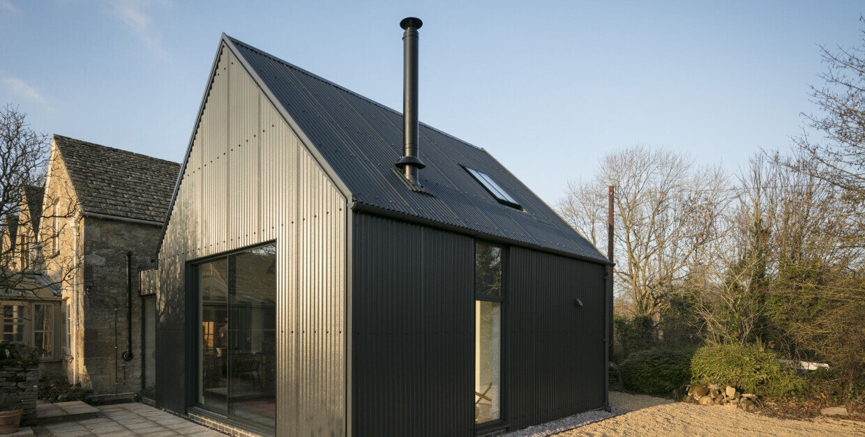
Work in progress for a house rooted in vernacular New England formal geometry. Materials range from Shou-sugi-ban wood to polycarbonate cladding. The structural module, program, section and plan have been thought through to a conceptual/schematic level. Studies of stairs, wall assemblies, and structural type could come next - but there is opportunity for all types of new exploration.
I want to build houses like this at some point, or at least develop a prototype for housing in New England, so I had 5 guiding goals I’d like to achieve:
1) Keep it simple
2) Choose complexity wisely
3) Incorporate passive sustainable design strategies
4) Renewable materials
5) Affordable construction
Iterative thoughts, sketches and design ideas about a simple house. I had distinct thoughts about morphology – a shed style roof. I also had distinct thoughts about materials and tectonics – shou sugi ban, polycarbonate, and corrugated metal cladding.
I tested proportion at several scales, and thought through the rough dimensions and major design characteristics. Some passive and active design strategies were fleshed out, such as stack effect ventilation, direction east-west orientation, and a PV array. Secondary design ideas about lofted space, balconies, both interior and exterior, and a barn door resonated with me quickly.
Simplicity, sustainability, and affordability are at the heart of this idea.
I studied the section in a more technical way. This led to some quick facade studies, testing the proportions and expression in thumbnail form. Trying to develop thoughts about cladding and tectonics, maybe breaking away from being married to an idea.
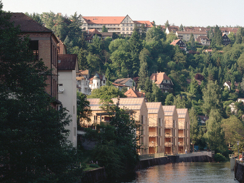
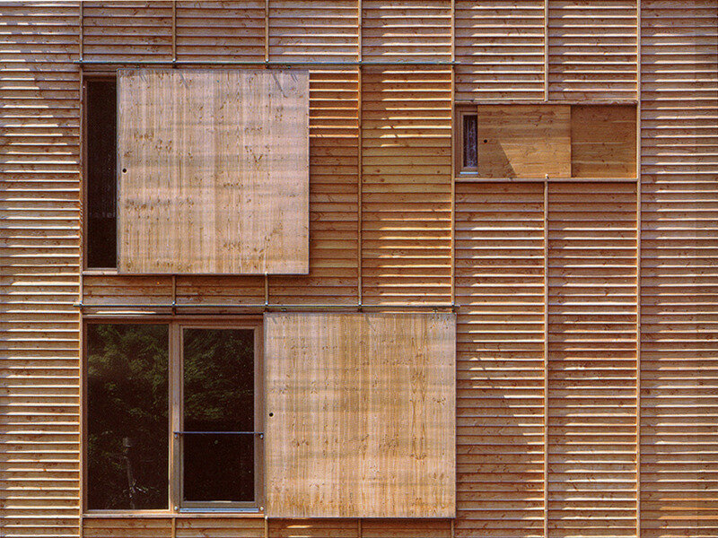
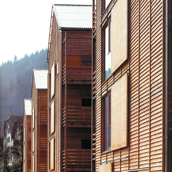
I was struck by this elderly housing complex by MGF Architeken. Its cladding, simplicity, and elegance of detail. It is dignified, handsome, and humane. I love the texture of the horizontal rungs captured by the vertical furring. The sliding window enclosures add an element of humane interaction with the architecture, and its simplicity adds so much interest and dynamism to a pretty sparse composition.
Section Study, Facade Studies, and Precedents
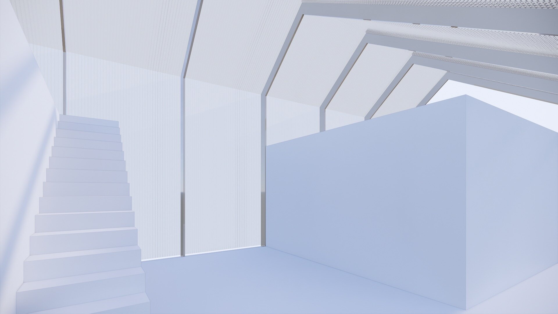
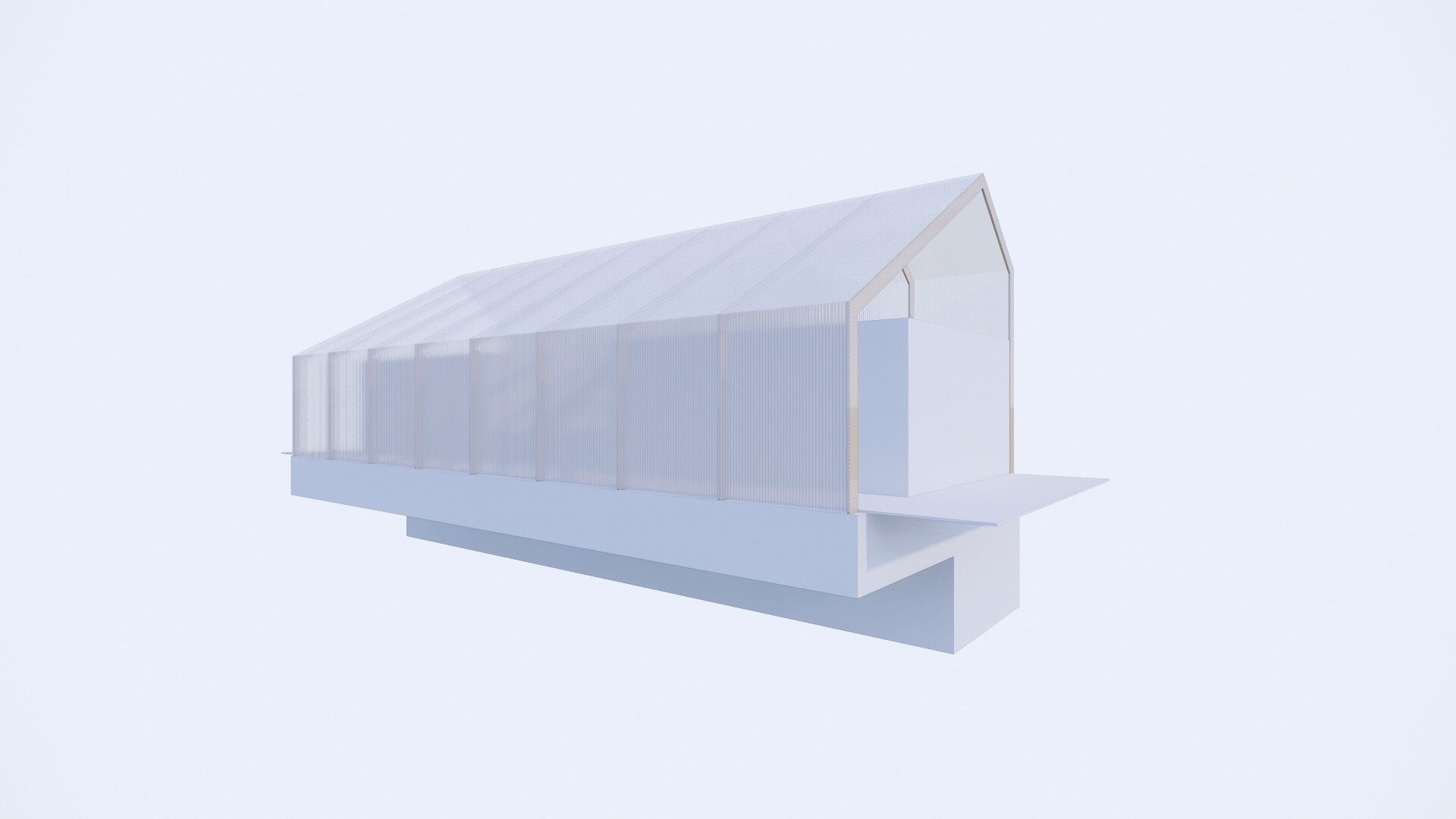
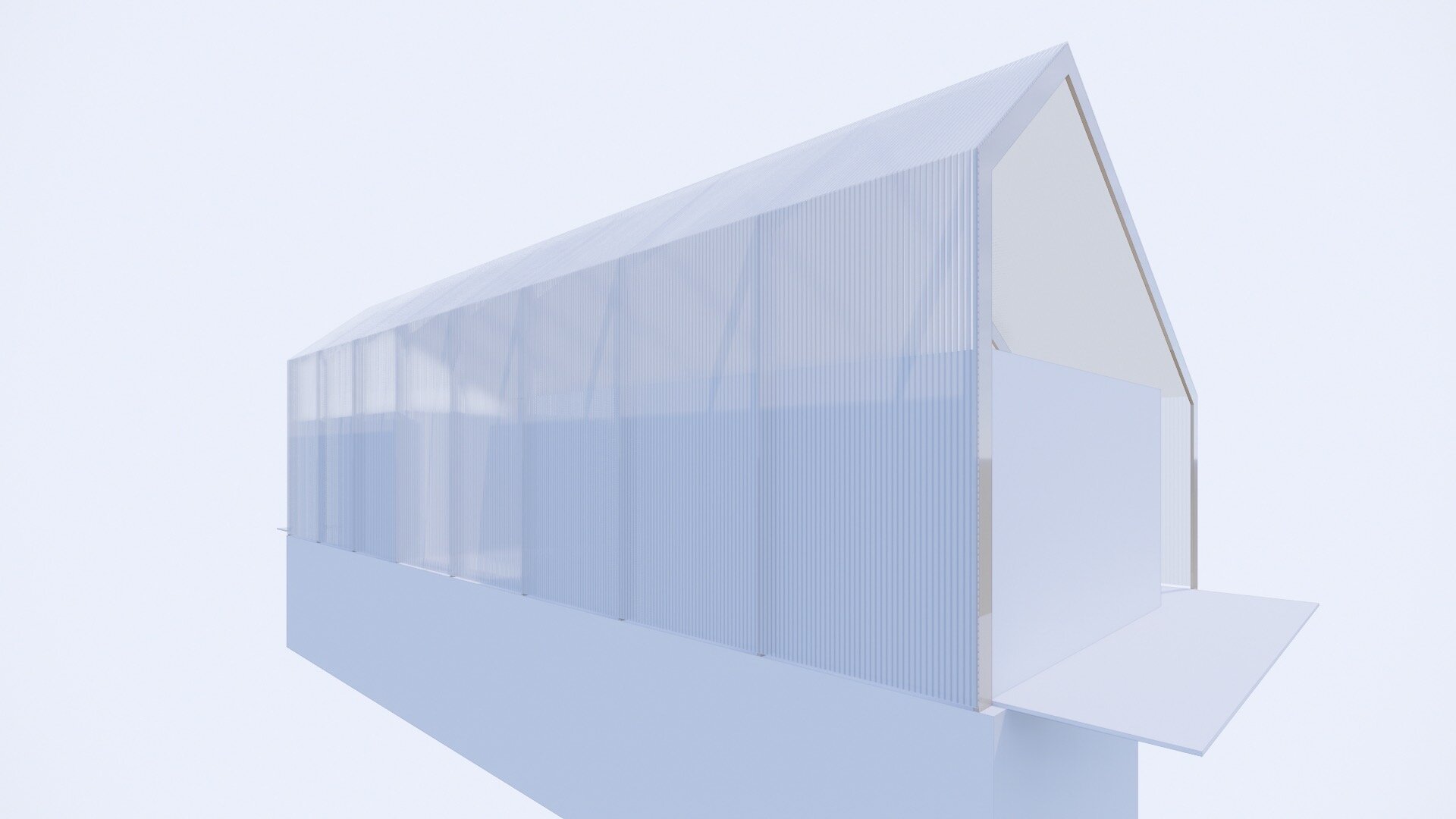
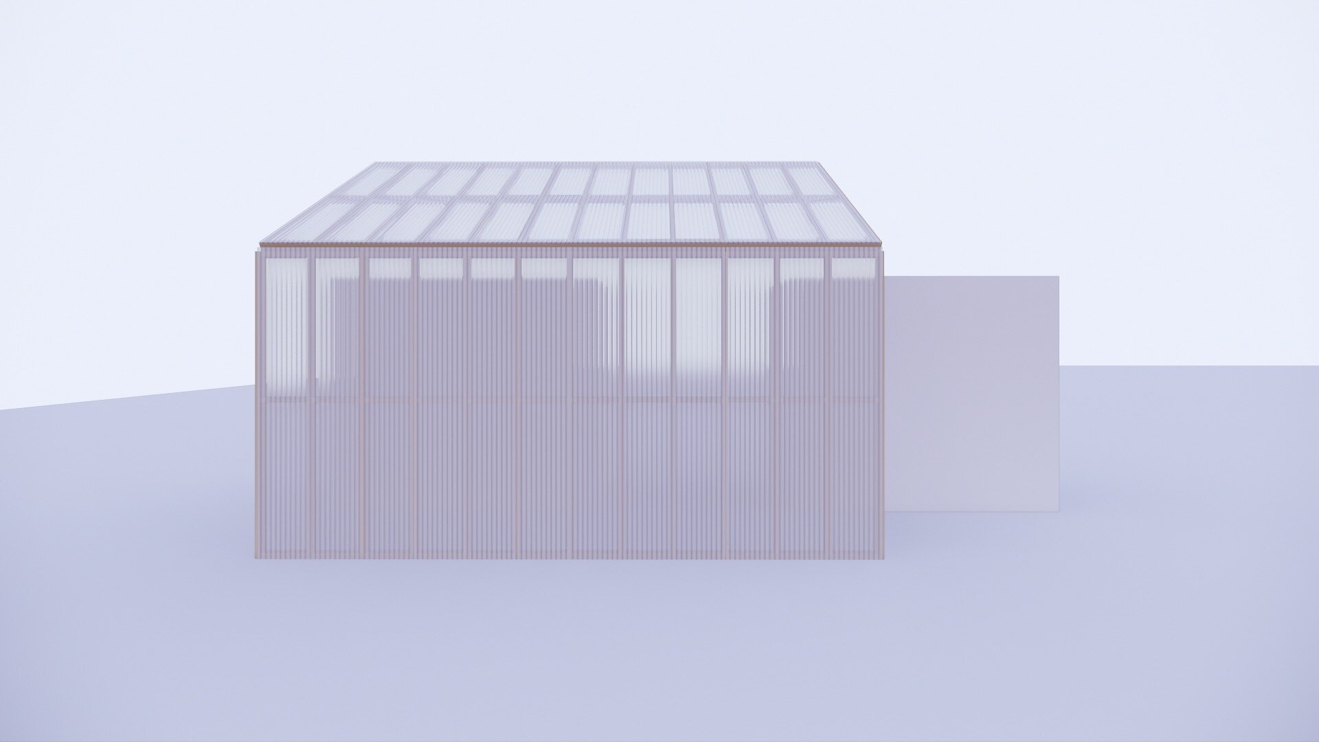
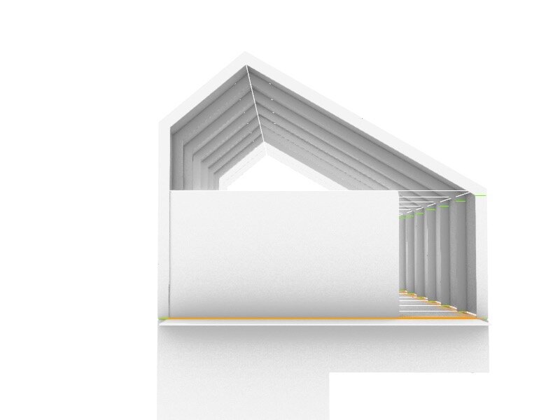
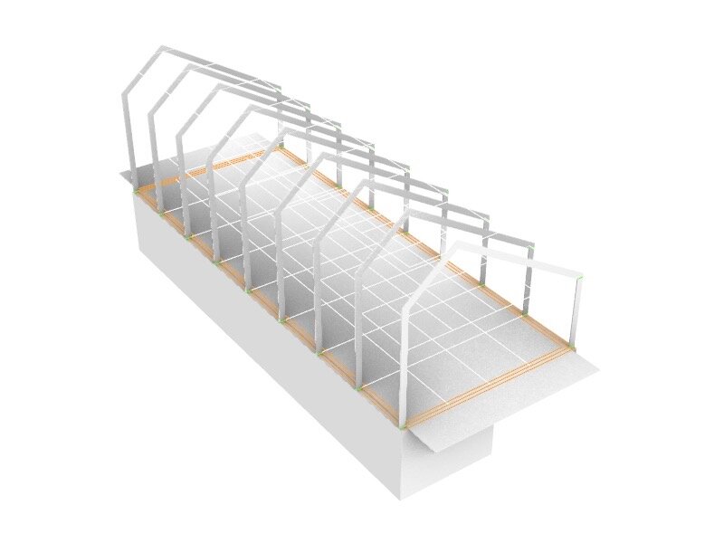
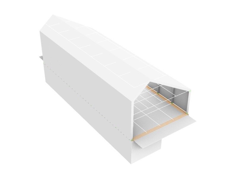
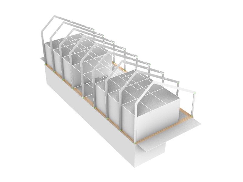
I made progress by basing a rough 3D model off of my sketches from the past two days. I set out a grid, chose the main structural dimensions – used a 1-3/4” x 10” LVL (Laminated Veneer Lumber) member for all lateral spans, built the outline of the main foundation, mocked up the main interior volumes, and worked out the stair size and location. I also made an image map and bump to emulate translucent polycarbonate for rendering. I applied it to the house’s envelope to get a sense of the material and its potential.
